Added
🕑Introducing the Timeline Chart
over 1 year ago by Adriano Toro

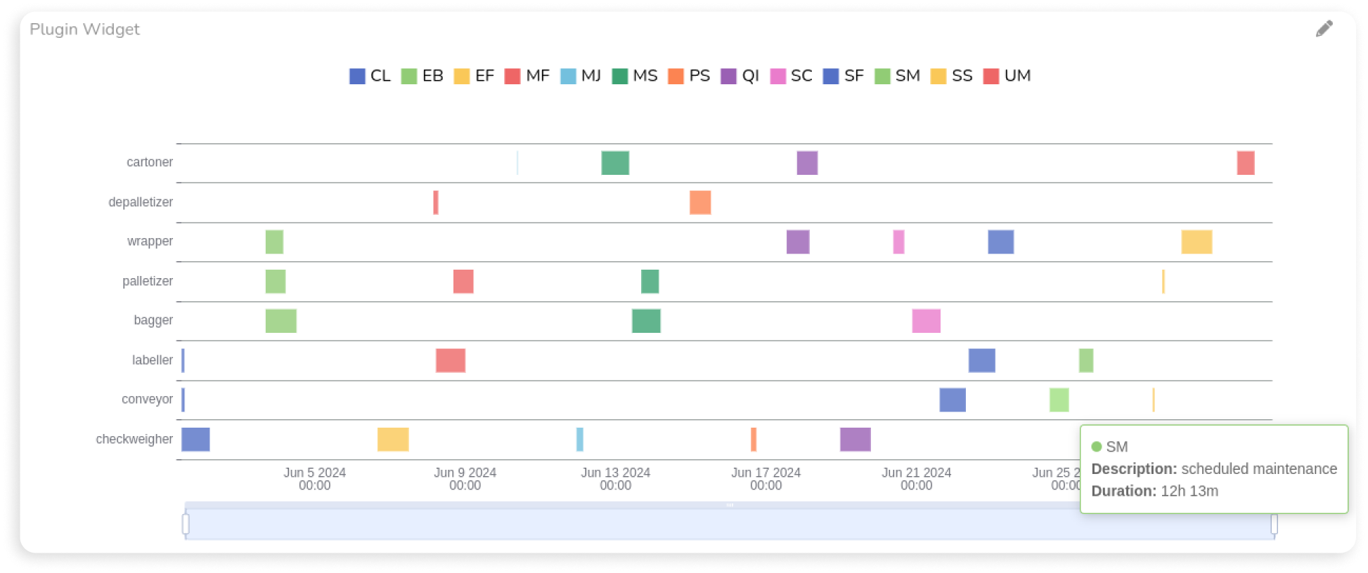
We’re also happy to introduce the Timeline Chart, a Widget Plugin that aggregates and displays breakdown times in production by grouping time series data. By analyzing when breakdowns occur, you can identify crucial patterns and trends to improve productivity and minimize downtime.
The widget creates a timeline where breakdowns are represented with colored bars whose width is proportional to the aggregated breakdown time. Understanding the timing and frequency of breakdowns helps pinpoint underlying issues, schedule maintenance more effectively, and enhance overall productivity.
