Improved
📈Highlight Data Gaps in Your Charts
about 1 year ago by Adriano Toro
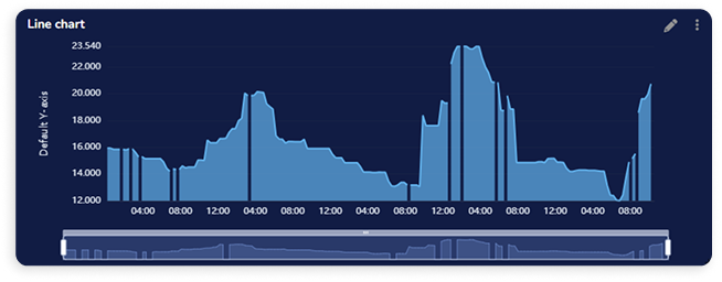
Line charts just got smarter. You can now configure your Line Chart widget to display gaps when no data is received within a set time interval—making data absence as meaningful as its presence. This new option allows you to define, per variable, how many seconds must pass between two data points before a gap is shown. It’s a powerful way to highlight interruptions in your data flow and better understand system behavior over time.